Gallery View vs. Other Views
All views share the same data, so switching between them never deletes or modifies your entries.Creating a Gallery View
1
Click the + button next to the view tabs at the top of your Collection
2
Select Add Gallery View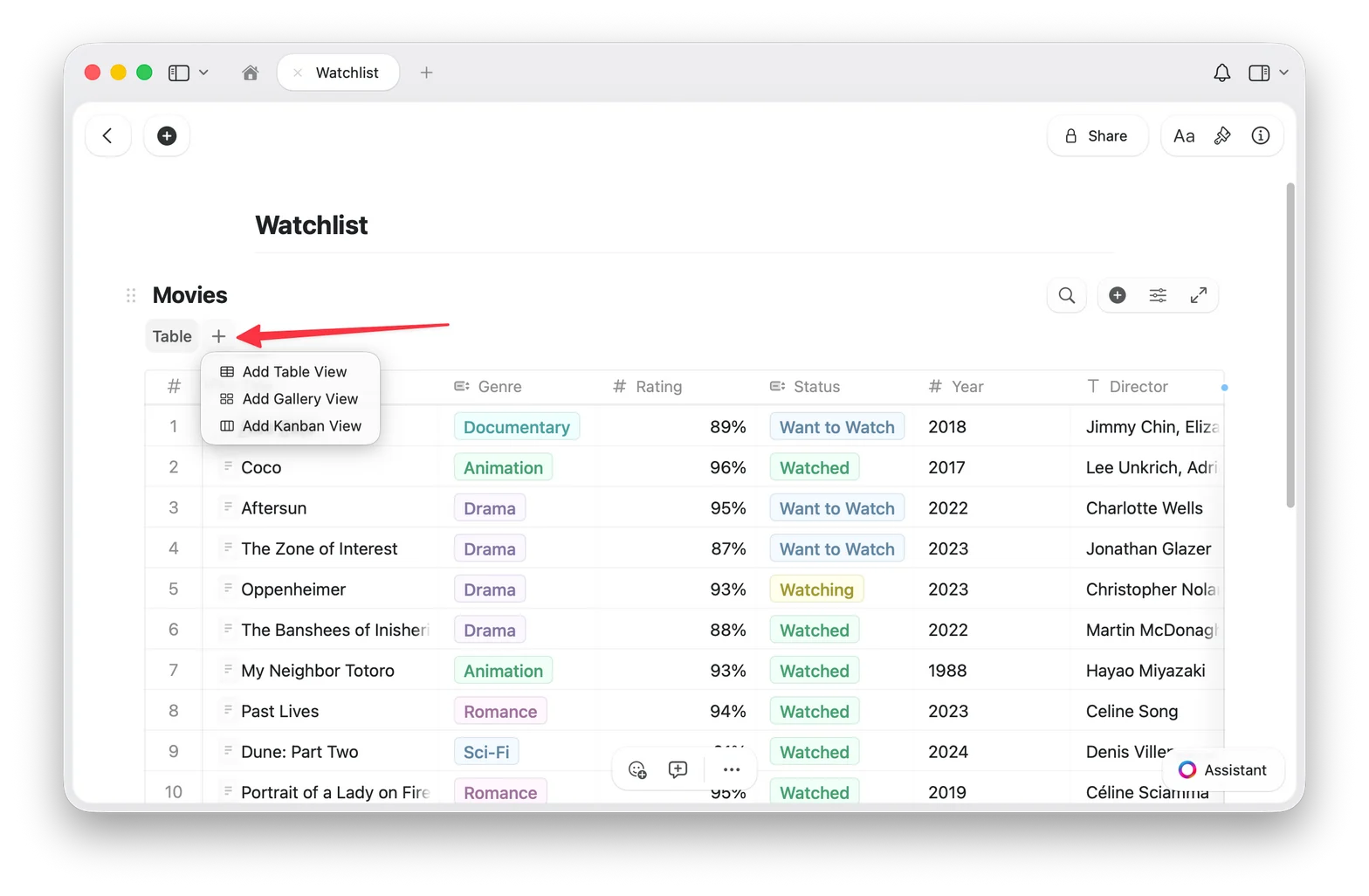
3
Your new Gallery View appears as a tab at the top of the Collection
Switching Back to Table View
If you have multiple views, click the Table view tab at the top of your Collection. If you only have one Gallery View, use the configure menu (⋯) to add a Table view. Your data is always safe: switching views never changes your entries.Preview Types
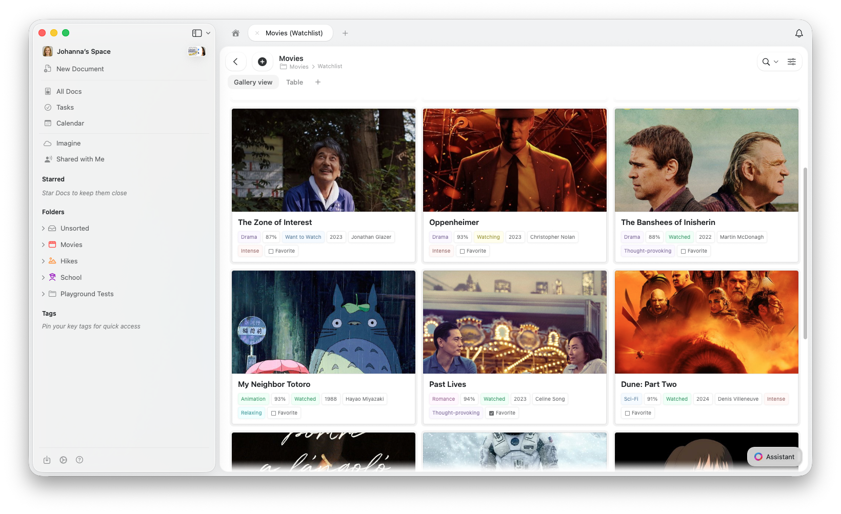
Gallery View pulls preview images from the content inside each entry’s page. To add an image to a card’s preview, open the entry and add an image block to its content. You can control how each card’s preview area is displayed:- Document (default): shows a preview of the entry’s page content
- Fill: fills the card’s preview area with the entry’s image
- Immersive: uses the image as a full-bleed card background
- No preview: hides the preview area entirely, showing only properties
Card Sizes
Gallery View offers two card sizes:- Small: compact grid, more cards visible at once
- Large: bigger previews, fewer cards per row
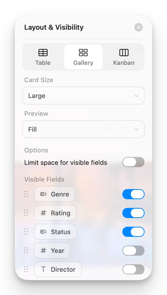
Gallery Options
Access Gallery Options from the configure menu (⋯) to customize your view:- Card Size: Small or Large
- Preview: Document, Fill, Immersive, or No preview
- Limit visible fields: when enabled (default), cards show a limited number of properties with a “+n” indicator for the rest. Turn this off to show every enabled field on each card.
- Fields: choose which fields appear on each card and toggle their visibility
Working with Gallery Cards
- Open an entry: click a card to open its full page
- Context menu: right-click (Mac) or long-press (iOS) for more options
- Select cards: click to select, Shift+click for multi-select
Sorting, Filtering, and Grouping
Gallery View supports sorting, filtering, and grouping, the same options available in Table View. Grouped galleries display section headers between card groups.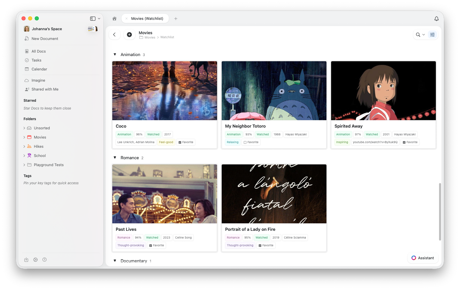
Troubleshooting
My cards don't show images
My cards don't show images
Gallery View pulls preview images from the content inside each entry’s page. To add an image, click a card to open the entry, then add an image block to the page content.Also check your Preview setting in Gallery Options and set it to Document or Fill.
I can't find the Gallery View option
I can't find the Gallery View option
Make sure your app is up to date. Check for updates in your app store or refresh your browser.
Gallery feels slow with many entries
Gallery feels slow with many entries
Gallery View loads image previews as you scroll. If performance feels sluggish, try reducing the number of visible properties on each card.
Related Articles
Collections
Learn about Craft Collections and field types
Collection Views
Create views with sorting, filtering, and grouping
Kanban View
Organize items into drag-and-drop columns by status or any select field
Reordering Fields and Columns
Customize field and column order in your Collections
Using Collections on iOS
Touch-optimized Collections on iPhone and iPad